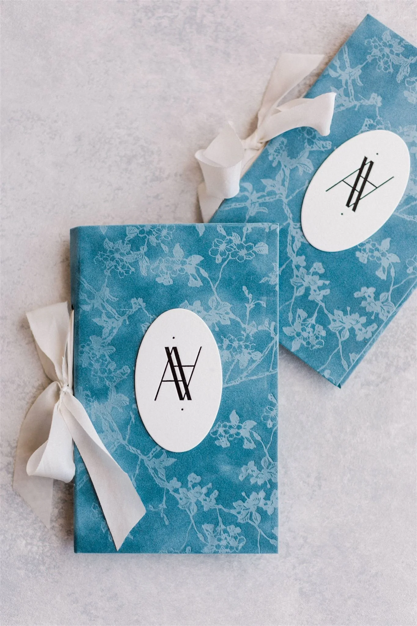
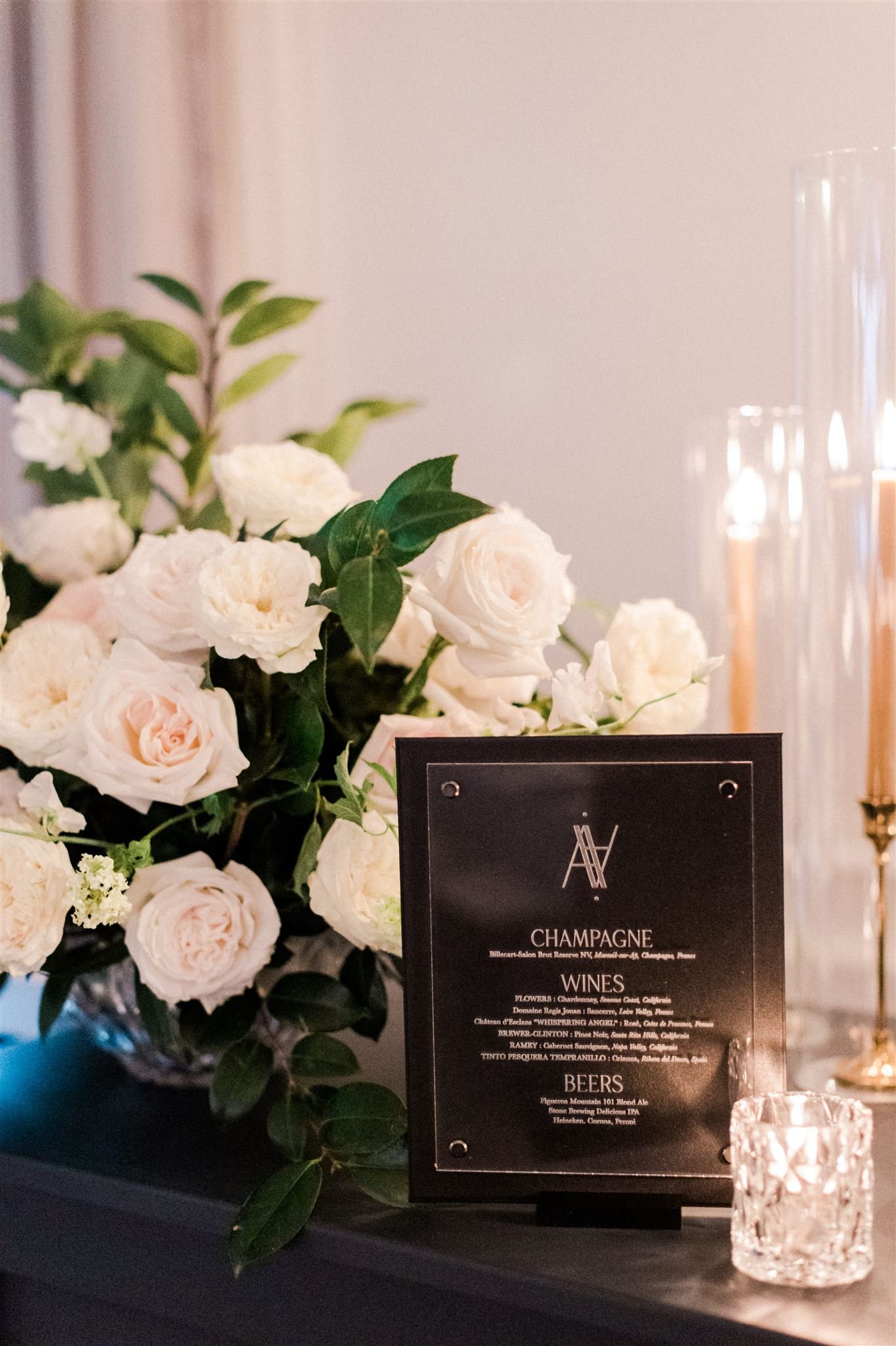
ashley + anthony tied the knot a year ago at the beautiful rosewood miramar beach in montecito, california. we couldn’t pass up an opportunity to share more for their incredible wedding weekend, but also wanted to give a behind the scenes look at the backstory of their branding. we spend a lot of time getting to know our couples + creating a brand that best represents them + their unique story. your branding is more than just 2 letters intertwined. it’s an opportunity to say much more. when we presented ashley + anthony with theirs, it quickly became a beloved event icon that made appearances throughout their weekend.
the branding was developed to communicate intentions for a healthy marriage. angular parallel lines play the role of forming the a + a letter structure, but also represent the couple’s relationship: traveling in a matching trajectory, and traveling it together. additionally, both letters are equal in height, representing seeing one another eye-to-eye with mutual respect + honor.
the monogram was the perfect modern touch to balance out the more classic elements + silhouettes in the suite. those took inspiration from their favorite travel destinations + the event property’s stunning wall coverings + art.
start scrolling + enjoy all the swoonworthy details from their incredible celebration! happy late anniversary a+a- thank you for trusting us with your vision + beautiful love story!!
design + planning: lynden lane co.
event day photography: valorie darling
venue: rosewood miramar beach


